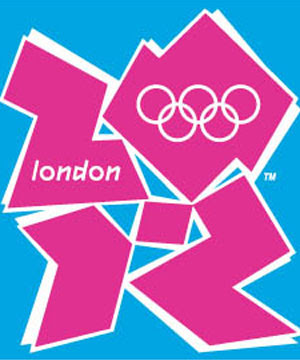
This is the newly unveiled logo for the London Olympics.
From the moment of its inception there has been criticism.
Developed by the brand consultancy group Wolff Olins, the logo and subsequent "brand" cost almost half a million pounds.
Immediately after it was introduced to the public an online petition to change the logo was established. It received 48, 615 signatures in just four days.
The logo is radically different than any other that has come before it. It carries none of the traditional representations of the host city, sports or Olympic colors. Things that most people have come to expect.
It is generally pretty ugly...I think.
You see I find it hard to condemn the logo to death so quickly, even as others seem to have no problem doing so. One critic even likened it to to"alcopop-induced vomit". Whatever that means.
I can't help but think of other radical introductions that have been met with the same overwhelming disapproval.
Impressionist painters were initially the laughing stock of the Paris art scene, their works often thrown out of art shows.
The Eiffel Tower was on the verge of being torn down after many in the city saw it as a terrible eye sore and a stain on the Paris cityscape.
Now I am not trying to liken the London Olympic logo to the plights of artists, architects or Parisians.
I am simply drawing on the fact that time is often the best judge and I wonder how the people of London will look upon this "puerile" logo in 1, 2 or 3 years time?
Maybe it will grown on people, maybe it won't?
But one thing is for sure the public opinion can't get much worse.

2 comments:
I had a grand mal seizure when I saw it for the first time.
Now everybody I work with thinks I have rabies.
I think you mean to say public, not pubic.
Post a Comment